Scatter charts are an essential part of data visualization and analysis. They enable us to understand patterns, correlations, and trends in a dataset. But, how exactly do we read and interpret them? In this article, we’ll explore everything you need to know about reading and interpreting a scatter chart. Keep reading.
Understanding the Basics of a Scatter Chart
A scatter chart, also known as a scatter plot or scatter graph, is a mathematical diagram that uses Cartesian coordinates to display values of typically two variables for a set of data. This type of visualization is particularly useful when dealing with large amounts of data points and when looking for potential correlations and trends.
The data in a scatter chart is represented as a collection of points. Each point’s position on a horizontal and vertical axis represents values for an individual data point. Scatter charts can accommodate a large number of data points without becoming cluttered, providing a thorough representation of a data set.
The scatter chart is often used in statistical analysis to identify if there’s a relationship or correlation between two variables. This could be a positive relationship, where both variables increase or decrease together, a negative relationship, where one variable increases as the other decreases, or no relationship at all.
Scatter charts also make it easy to observe how the data is distributed. It allows us to see whether the data is clustered in one area, is mostly spread out, or if there are any unusual points (outliers).
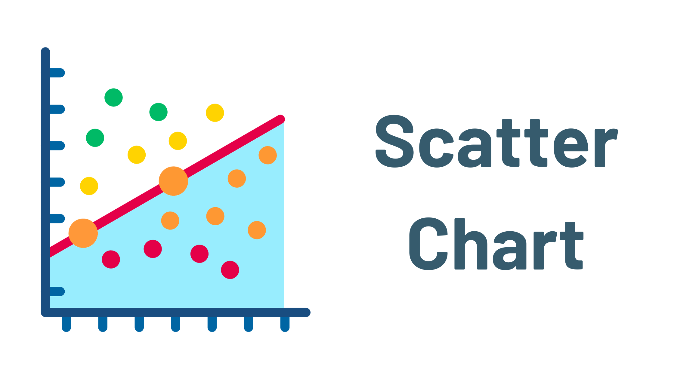
Breaking Down Scatter Chart Components
Alt text: Dots on a black background connected in a graphical form.
Before you start reading a scatter chart, it’s crucial to understand its main components. The scatter chart consists of an x-axis (horizontal axis), a y-axis (vertical axis), and plotted points representing individual data points.
The x-axis usually reflects the independent variable, i.e., the variable that does not depend on any other factors. Conversely, the y-axis depicts the dependent variable, the factor that varies based on the independent variable.
Each point on the graph represents one observation from the dataset. The position of this point is determined by the values of the two variables: the x-coordinate correlates with the independent variable value, and the y-coordinate with the dependent variable value.
Additionally, if a trend line, also known as a line of best fit, is included in your scatter chart, it represents an estimation of the relationship between the two variables. This line assists in visualizing and predicting trends based on the existing data.
Practical Steps to Read a Scatter Chart
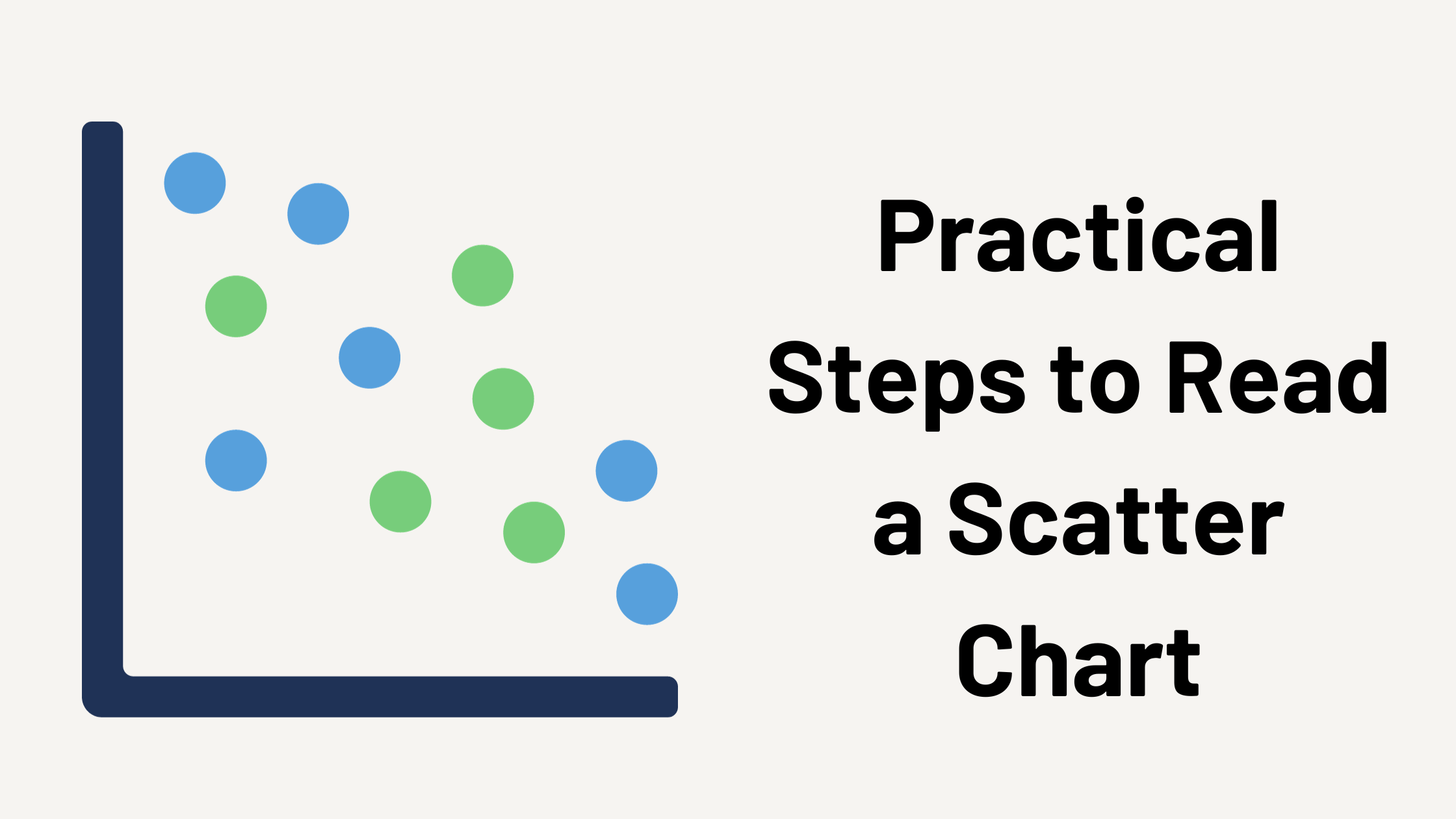
Practical Steps to Read a Scatter Chart
Alt text: A collection of dots scattered throughout a black background representing a scatter chart.
Reading a scatter chart means understanding what the plot points, axes, and trend lines (if applicable) are telling us. Begin by observing the variables on the x-axis and y-axis. Know what each one represents and its scale. Next, look at the distribution of the points. Corrections, trends, clusters, or outliers should become evident.
For instance, a positive correlation is indicated when the data points generally go from lower left to upper right on the chart, showing that the data is increasing together. A negative correlation, on the other hand, is portrayed through data points progressing from upper left to lower right, indicating that as the x variable increases, the y variable decreases.
If the scatter chart includes a trend line, use it to estimate the relationship between the variables. Keep in mind that this line is not meant to fit every point perfectly, but instead, it gives an overall direction of the data points.
Lastly, look for any outliers—points that do not fit the general trend of your data. These can be valuable for understanding potential errors or abnormal conditions.
Altogether, understanding and interpreting a scatter chart may seem complex at first. However, with regular practice and a critical eye, you will find it an uncomplicated and effective tool for analyzing and understanding data.